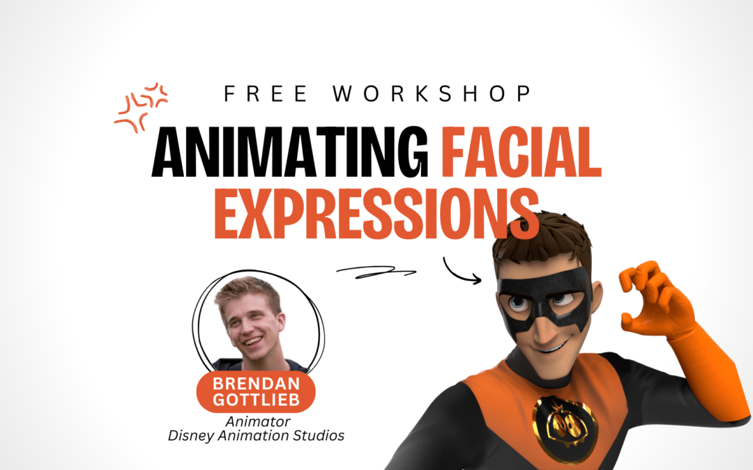
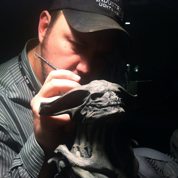
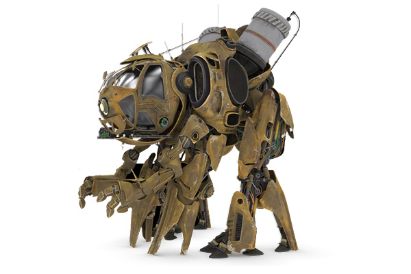
Meet Hatch. Hatch is a badass. Yeah, we said it. Hatch was custom-made for Animation Mentor students by Industrial Light & Magic Digital Artist, Landis Fields, who developed him with VFX professionals Aaron Wilson and Jay Machado.
Hatch is the newest member to the Animation Mentor lineup of awesome visual effects assets. Hatch is posable and ready for lighting students to render in our new Maya Workshop: CG Lighting and Compositing with Autodesk’s Mental Ray. But soon, Hatch will be ready for students in our VFX Fundamentals program to light and render him in Solid Angle’s Arnold. Wait, wait, there’s more! Down the line, a fully-rigged Hatch will be available for Creature Animation: Fight and Flight and other advanced animation classes.
We brought Landis Fields to the blog to share his thought process behind Hatch and tips he has for designing an awesome asset. Huge thanks and props to Landis, Aaron and Jay for their incredible work bringing Hatch to life.
-The Animation Mentor Crew
—
By: Landis Fields
1. WRITE FIRST, DESIGN LATER
I always write down my ideas and come up with a story that will drive the design rather than just blindly jumping into sketching/concept modeling right out of the gate. This and the blocking phase has become my favorite part. In the case of Hatch I knew right away what I didn’t want to do, and that was to make it a war machine with guns. Instead I jammed through some ideas using the notes on my phone and came up with the Bio F.A.R.M. concept (Bio Fuel Agricultural Recovery Mech). This simple step of laying down a story before you start will carve out a design path, add an extra level of believability to the final piece, and can get you out of a pinch when you hit a wall under tight deadlines. Designing in 3D saves time in some ways, but has the potential to be a black hole in others. Thinking through your designs by writing down ideas will allow you to focus on executing your concept rather than chasing it.
2. KNOW YOUR AUDIENCE
Once you have a story idea to build from, you should consider who will be viewing and using the design in the end. For Hatch I knew that it would be used by upcoming professionals who want something fun yet challenging to learn with. This served as a foundation for specific design choices that were made to prepare the students for working with a real world asset while keeping them engaged with an appealing, playful, and appropriate design that they can be proud to put on their reel.
3. MAKE IT PERSONAL
This stuff is a lot of work, so I always try to remember why I got into it in the first place … because it’s fun and personal to me. With that in mind, I try and put something personal into every design I make. Whether it’s a rusty step from the back of an old truck that I remember from my great grandfather’s yard, a mechanism from my F16 days in the Air Force, or even a photo of a rock I found on the beach with my wife. Adding personal elements to your art keeps it interesting by working from a different perspective, and most of all the result is something truly unique that could only have come from you.
4. “LIVED IN” UNIVERSE
Everything we interact with in the real world has characteristics (even if trivial) that reveal its function and how characters interact with it. For example, when you see something as simple as a keyhole on the steering wheel of a car there are tiny scratches caused by the driver using the key to feel around for the socket. Whether you’re emulating an object from our world or creating a spaceship for a distant planet, this still applies (more so if it is something the viewer hasn’t seen before). Applying small details throughout your design such as cables that tie down to a panel that would otherwise flop around when its flying, banging up a neighboring panel that gets hit by the cockpit canopy when it opens (even if it’s closed in the final piece), etc. All this stuff helps add up and tell the viewer a visual story about your design and the world it belongs to.
5. AVOID SYMMETRY (when realistically possible)
I say “realistically possible” because if you’re doing a design at home that’s one thing, go to town with the unique brush and have fun! However, if you’re doing something that is to be used as a production asset, most of the time other disciplines might rely on the design being symmetrical to cut down on the schedule to stay on budget. Basically, if you are mirroring the asset from right to left then that cuts the work in half. In short, if you go hog wild making everything asymmetrical you will have a texture artist, a rigger, animator, and production coordinator waiting for you after work in the parking lot with a crowbar. That said, if you’re clever, you can introduce the illusion of asymmetry throughout, simply by having a few key pieces be unique from one side to the other. Use it sparingly where it counts, but use it nonetheless.
6. TEAM WORK
After you get your fill of making things by yourself in a cave like a crazy person, you will one day step out of the shadows to work with the other humans. Embrace the people around you and their ideas because it’s a gift when someone tells you something. Run ideas past people to get a fresh perspective even if it’s something as simple as how a space helmet might unmount from the rest of the suit of a design. It doesn’t have to be someone you work with either. I have become dependent on getting my wife’s opinion for almost every piece I do, she’s my secret weapon.
7. SCALE
This is a big one, or little one. Anyways, be conscious of the size of your design. I know that might sound obvious, but scale is something that you will struggle with throughout your career. Just when you let your guard down it’ll bite ya. Simply relying on a character placed next to your concept isn’t good enough either. This goes hand-in-hand with number 4 above (LIVED IN UNIVERSE). Question yourself constantly while you work and be aware of shapes that are ingrained in the minds of the viewer. Should there be a maintenance ladder on the side of the ship next to that really cool Hatch you just made, which just happens to kinda look like a bolt from a distance? These type of details are a part of every viewers visual vocabulary, so as soon as they lock into these patterns they will start to draw conclusions whether you want them to or not.
8. CAMERA
One thing that I didn’t learn when first starting out that I now see others lacking coming out of school is knowing how to use a camera — the device that governs our medium. Knowing how to use focal length and depth of field in your artwork is not only an indispensable skill set, but it is assumed in a studio environment. Start by composing your camera in a way that it would be viewed if we were inside the painting. If it’s a ship what does it look like six-feet off the ground looking up at it as if we were standing next to it in the hanger? This ties into number 7 above (SCALE), all of these concepts are interconnected.
9. SILHOUETTE
The older I get the more I enjoy getting a design to read without any internal detail. If your creature or robot looks killer as a solid color then it’s going to work when you start tricking out the details. Unfortunately, this does not work the other way around. Block in your design using primitives first without any lighting to get it working from all angles, then you can begin.
10. DO IT!
As awesome and exciting of a time it is to be an artist, it is also the most distracting it has ever been in the history of mankind. Don’t get caught up in what software package is being used by another artist or company. Don’t spend a ton of money you don’t have on buying the best hardware, sculpting tools, and paint supplies. You would be surprised at how much you subconsciously procrastinate and it can get expensive. Instead just get in there, roll up your sleeves and make some stuff with what you have. Start piling up art and learn from your mistakes, as well as your victories. The more you fail the better you will get. Just remember, people were making amazing stuff way before computers and the latest video card isn’t gonna dig you out of a creative jam the night before a deadline. Take the time to find out what it is that you like to do, be honest with yourself, and identify your weaknesses. The more things you make, the faster the medium you enjoy the most will present itself. Experiment with your approach if time allows for it to discover new techniques that will reinvent the way you look at the world. Above all, don’t sit around talking about this stuff like I am right now, DO IT!
—
Want to take Hatch for a spin? Register for Maya Workshop: CG Lighting and Compositing today.
