Yasin Hasanian is a VFX artist who continues to stun the world with his work. Today, Yasin drops by the Animation Mentor to share his tips for how to light an animation sequence from concept to light setups to polish. Big thank you to Yasin for sharing his passion and knowledge with the Animation Mentor community!
-The Animation Mentor Crew

Where do you start when lighting a sequence?
Generally, there are two cases when it comes to lighting. First case is when I have done the shading of the scene myself, whereas the other case in which I have not worked on the shading and only responsible for lighting. This is critical to have in mind because at some points it helps me skip some parts. In the former scenario, I’m aware of how the materials in the scene react to light and I’m able to start lighting right of the bat and play with different looks that I’m looking up to, whereas in the other scenario, the scene might have been shaded in many different ways under specific light setups by other artists, for example, non-photorealsitic (NPR) shadings are usually not done under the same lighting condition as physically plausible shadings, and this matter specially varies a lot for NPR scenes where you need to investigate material and analyze or find the rough logic behind such shadings. One very obvious and simple way to get a quick idea of how the materials work in this case is by creating a single light source and progressively tweak the light parameters to find a decent balance throughout the look of the scene. Doing so helps me somewhat figure out the logic behind the scene materials and find the answers to the questions like, Are the materials reflective or diffuse? How much reflection do they have? What are their diffuse features? and so on.
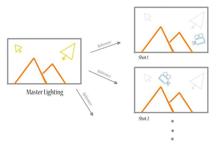
Another factor I need to resolve in the beginning is determining the consistency between different shots throughout the whole sequence, such as the various locations, times of day and camera moves to name a few. Therefore, In sequences, it is definitely wiser to setup a fixed master lighting setup for one specific setting rather than trying to achieve a certain look from the scratch for each shot one by one. Not only this is a waste of time but also breaking the look consistency if done individually. Further desirable lighting tweaks for each shot under similar settings can be easily be done by modifying the master lighting per shot and adding your own touches while still maintaining the consistency.
How do you approach coming up with a style for the animation?
Moving on to the actual lighting, first of it all it is necessary to know the style, concept and/or color keys of the project. This is necessary to know because lighting does have an absolutely direct influence on the whole scene, to illustrate this further, the light value gets multiplied by the objects color, for instance, If there is just a completely red sphere and a completely blue light in a closed space, what you would see after turning on the light is nothing! That’s simply due to the fact that the red sphere has no blue component nor the blue light has any red component in it’s color, thus, when they get multiplied the result is equal to black. As a consequence, lighting plays an important role in justifying the desirable mood of the sequence.
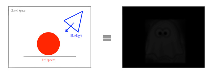
The color keys and overall required mood give me ideas about the style I look forward to achieve. Additionally, finding couple of references always help a lot. If we take into account the two main styles of CG animation, photo-real and cartoony, the amount of freedom one has in the cartoony type is quite a lot more as he/she can play with various lighting setups and basically break any physical rules without it seeming “wrong”, thus, the possibilities in this case are endless and it becomes literally fun to accomplish the task! Personally, in the cartoony style I’m more fond of contrasty looks and try to make the image pop with strong tones to attract the viewer’s attention. Furthermore, frame composition adds substantially to the image if done well i.e. defining foreground, mid ground (optional) and background and balance the lighting across these three sections beautifully so that the viewer’s eyes is guided directly to look at the center of interest in the image. Essentially, a good lighting can tell the animation story itself to a large extent.
What are tricks you use to keep the lighting similar between shots?
That’s an interesting question! Basically, there is no one solution to this at all and it heavily relies on the way the scene and its lighting is setup. If we categorize light setups into static/dynamic and global/local, early in production we can decide on what approach to take in order to keep lighting consistent throughout the animation. Static lights are those that stay the same all the time, while dynamic lights has some animations on them and vary in time. Global lights are those that it doesn’t matter whether they are occluded by some other objects or not, while local lights are like lamps or just some auxiliary lights that help to improve the look. If the lighting is not supposed to change that much I try to implement the lights as much as possible into a single HDR skydome light in the master lighting scene, and later publish it across all the relevant shots. This method works great, fast and manageable for most global static(also dynamic) lighting scenarios which are usually exterior shots. For interior shots that most of the time are lit with local lights, placing actual lights in the master lighting scene is a better option unless you can bake the lighting data to a point cloud (or objects in the scene) and use that to light your scene, but that requires some more technical works.


